2021 Sales Report Analysis
Welcome to my 2021 Sales Report Analysis project, a showcase of my data analysis and visualization skills using Microsoft Excel. This project highlights my ability to work with large datasets, perform detailed regional and employee performance analyses, and create interactive reports with visualizations and conditional formatting to support data-driven decision-making. For the full experience, including all features, functionality, and intended formatting, download the .xlsx file and view it in the desktop version of Excel. Scroll down to dive deeper into the project details.
Introduction
The 2021 Sales Report Analysis project aimed to organize, analyze, and visualize sales data for a fictitious company using Microsoft Excel. The dataset comprised 389 records of sales transactions, including details such as employee names, sales regions, sales amounts, targets, and payment types. Through the application of Excel's analytical and visualization features, the project delivered a comprehensive report that facilitates data-driven decision-making.
Objective
- Analyze sales performance across four sales regions: North, South, East, and West.
- Provide detailed insights into employee contributions and regional sales trends.
- Visualize sales and commission data for quick understanding.
- Create an organized and interactive report that is easy to navigate.
Results
Regional Sales and Commission Performance
Total sales and commissions by region were:
- North: $1,945,833.20 (Sales), $157,168.13 (Commission)
- South: $1,812,496.30 (Sales), $138,552.42 (Commission)
- East: $1,805,833.60 (Sales), $147,698.53 (Commission)
- West: $1,722,387.90 (Sales), $128,660.96 (Commission)
Monthly Sales Trends
The Sales Analysis sheet revealed the highest sales month was March ($849,269.00), while the lowest was June ($424,936.80). The total annual sales were $7,286,551.00.
Employee and Regional Insights
Highlighted top-performing employees in each region. Enhanced decision-making with slicers and payment type filters.
Key Features Utilized
- Data Transformation: Used Excel formulas to calculate over/under sales and commissions.
- Data Visualization: Created bar charts and summary tables to present insights.
- Conditional Formatting: Highlighted significant data points (e.g., top 5 sales amounts).
- Interactivity: Integrated slicers and navigation links for an improved user experience.
- Data Cleaning and Structuring: Extracted and formatted raw .csv data into a structured table.
Conclusion
This project highlights the power of Excel in managing and analyzing sales data to uncover key business insights. By implementing advanced Excel functionalities, I successfully organized the data, performed in-depth analyses, and presented findings in a visually appealing and interactive format. The resulting report is a valuable tool for understanding regional performance, monthly trends, and employee contributions.
Methodology
Data Organization
Imported the raw sales data into the "All Sales (raw data)" sheet and copied it into the "All Sales Table" sheet. Transformed the data by creating an additional column, Over/Under, which calculated whether each sale was above or below the target of $15,000. The column displayed values in black for above-target sales and in red for below-target sales.
Regional Analysis
Segmented sales data into four separate sheets (North, South, East, West), each containing only the sales records for the respective region. Applied conditional formatting to highlight the top 5 sales amounts in green in the Sales Amount column. Summarized the total annual sales for the top five salespeople in each region, displaying their names and total sales figures in the top corner of each regional sheet.
Data Visualization
Created a Chart sheet containing:
- A table summarizing total sales and commissions for each region.
- A bar chart titled "Sales 2021" showing two bars per region—one for total sales and another for total commission.
Interactive Analysis
Developed the Sales Analysis sheet, which included:
- A table displaying monthly sales totals, percentages of the grand total, and an overall grand total.
- Slicers to filter data by sales area (North, South, East, West) and employee.
- A filter to analyze data by payment type.
New Staff Data Extraction
Extracted and transformed employee data from a .csv file into the New Staff sheet. Organized the data into a structured table with columns for Name, Payroll Code, First Name, Last Name, and Area (abbreviated to two letters: NE, NW, SE, SW).
Usability Enhancements
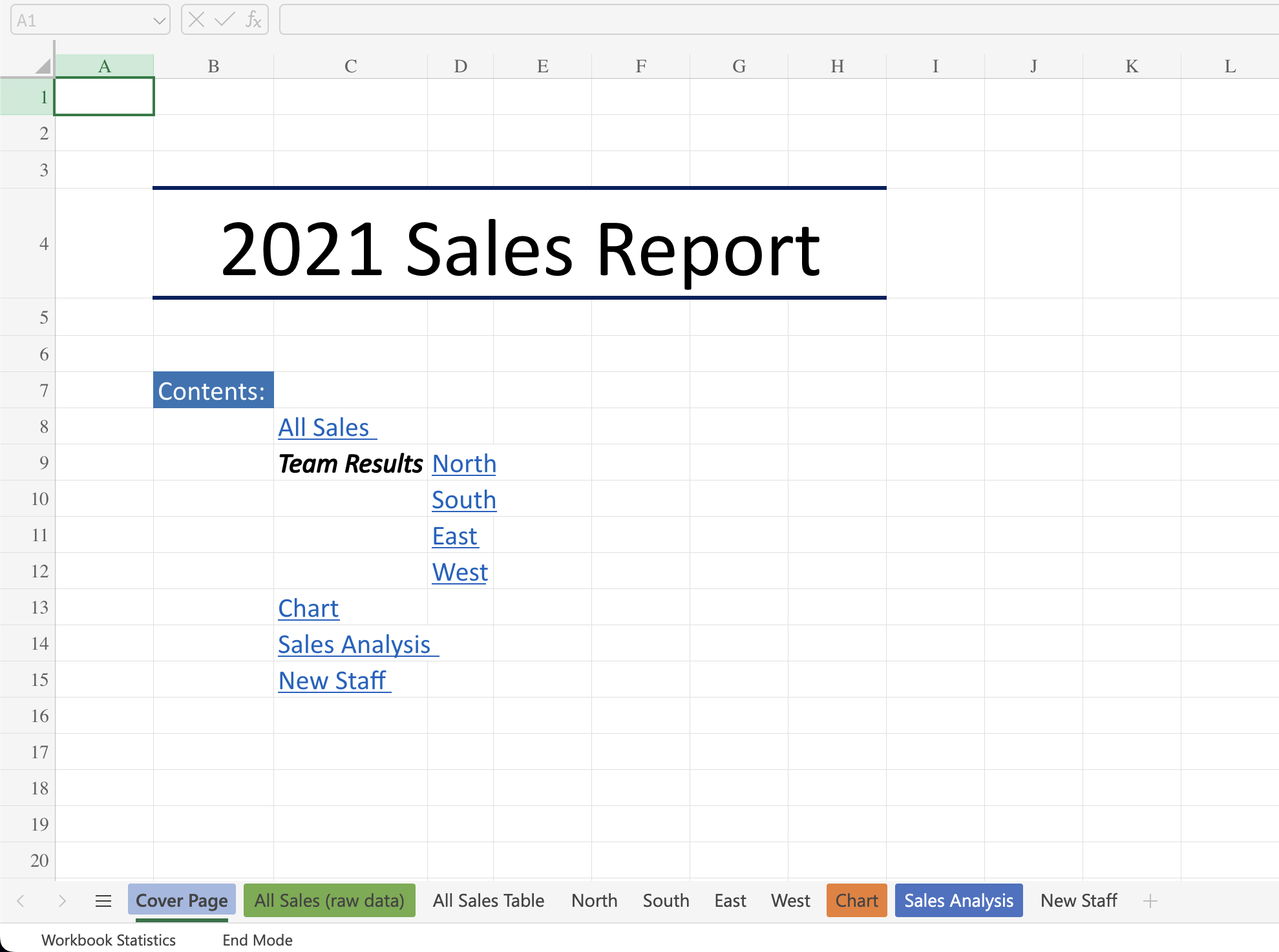
Designed a Cover Page featuring the title "2021 Sales Report" and a table of contents linked to all sheets in the workbook for seamless navigation. Added "Back to Cover Page" navigation links to the top-right corner of every sheet (except the Cover Page). Applied the Freeze Panes feature to headers in all data tables for better readability when scrolling.