Bike Sales Dashboard
Welcome to my Bike Sales Dashboard project, an example of how I transform raw data into actionable insights using Microsoft Excel. This project highlights my expertise in data cleaning, analysis, and visualization to uncover key trends and patterns in customer behavior. Through interactive dashboards and slicers, I provide a comprehensive look at the factors influencing bike purchases, demonstrating skills that align with real-world business needs.
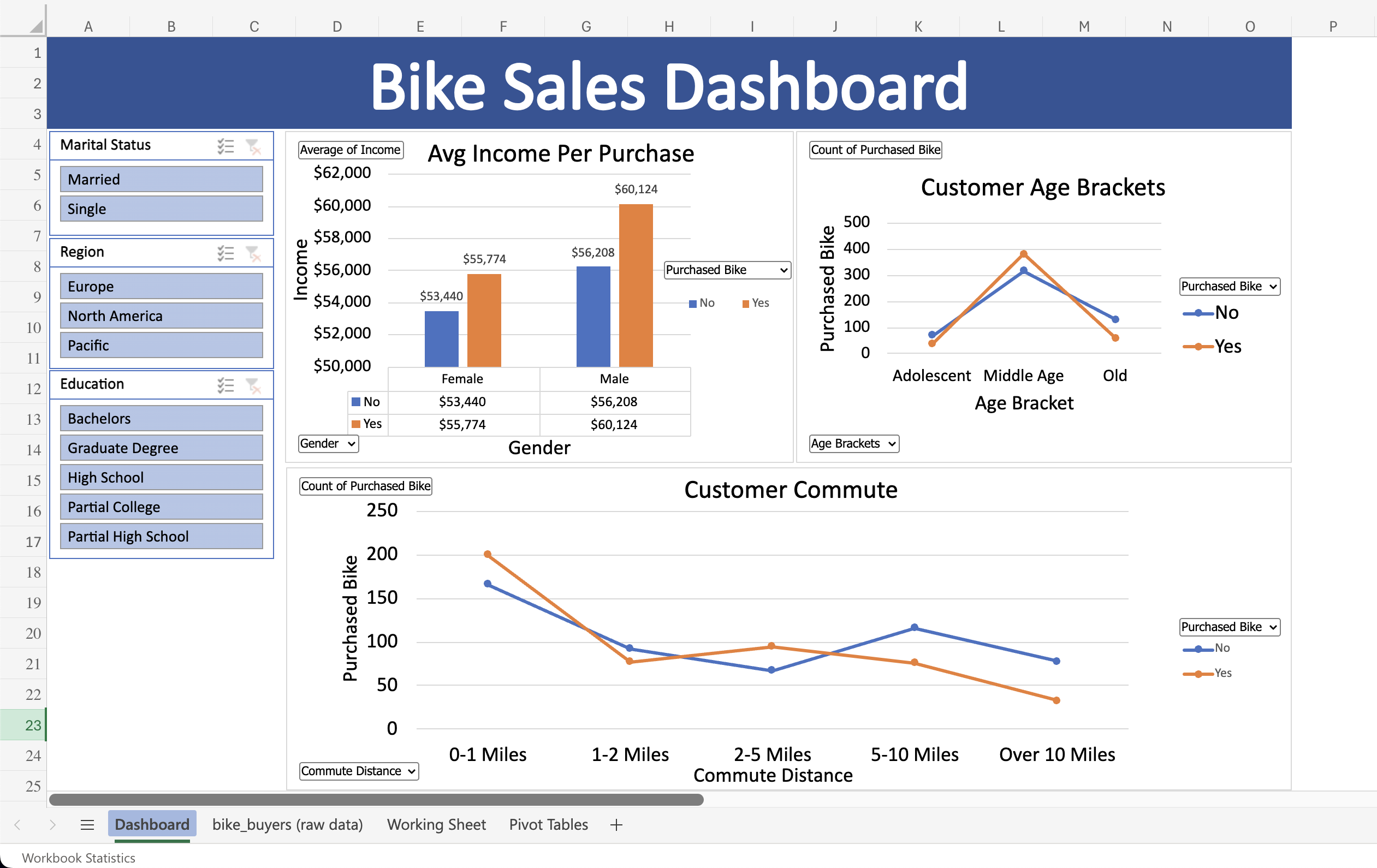
Bike Sales Dashboard
This project showcases my ability to clean and analyze data, create pivot tables and charts, and design an interactive dashboard in Microsoft Excel. Starting with a dataset of 1,026 records, I transformed the raw data into actionable insights.
Process
- Working Sheet: I began by copying and pasting the raw data into a separate sheet, where I cleaned and modified the dataset for analysis.
- Pivot Tables: Using a dedicated sheet, I created pivot tables and charts to summarize key metrics and trends.
- Dashboard: I designed an interactive dashboard by combining visuals from the pivot tables sheet and adding slicers for "Marital Status," "Region," and "Education" to enhance interactivity.
Key Insights
- Income and Purchases: The income of people who purchased bikes was $2,000 to nearly $4,000 greater than those who did not.
- Age Brackets: Middle-aged individuals (ages 30-55) purchased the most bikes compared to younger and older groups.
- Commute Distance: Customers with a commute between 0-1 miles bought the most bikes, followed by those commuting 1-2 miles, 2-5 miles, 5-10 miles, and over 10 miles.
This dashboard demonstrates my ability to derive meaningful insights and create interactive reports that can support data-driven decision-making. To experience the full functionality, download the .xlsx file and explore it in the desktop version of Excel.